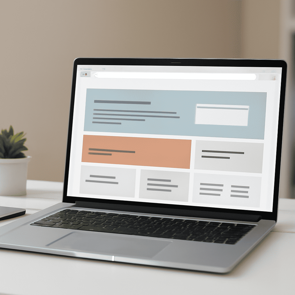
In the realm of crafting digital experiences, CSS (Cascading Style Sheets) plays a pivotal role in elevating the aesthetic and functional facets of a project. By employing advanced styling techniques, creators can transform static pages into dynamic, engaging interfaces, enhancing both visual appeal and user interaction.
One foundational aspect of CSS is its ability to separate structure from presentation. This separation allows content to be flexible and adaptable, providing consistency and better control across various platforms and devices. Let's delve into some effective strategies that can help breathe life into your digital designs.
1. Responsive Design
A cornerstone of modern digital projects, responsive design ensures that layouts adjust seamlessly to different screen sizes. CSS media queries are instrumental in this, allowing designers to specify different styles for different devices. By accommodating diverse screen resolutions and orientations, media queries help maintain a uniform look and feel, optimizing user experience across a variety of devices.
2. Flexbox and Grid Systems
The advent of flexbox and CSS grid has revolutionized layout creation. Flexbox offers a one-dimensional layout model perfect for aligning items in a row or column, while the grid layout provides a two-dimensional framework, enabling more complex and responsive layouts. These systems reduce the need for float-based layouts and make creating responsive designs more intuitive.
3. Custom Properties (CSS Variables)
CSS variables, defined by the user, allow for more manageable and scalable stylesheets. By defining properties at the root level, changes can be propagated easily across the entire project. This feature not only fosters maintainability but also enables complex theming and design systems to be implemented with ease.
4. Animation and Transitions
Subtle animations and transitions can significantly enhance interface interactions. CSS provides a variety of tools for creating animations, such as @keyframes for defining the stages of an animation and transitions for smoothly shifting from one style to another. When used judiciously, these effects can draw attention to specific content, guide users’ focus, and deliver a richer experience.
5. Pseudo-classes and Pseudo-elements
These allow for enhanced styling possibilities without altering the HTML structure. Pseudo-classes like :hover and :focus can manage interactivity, while pseudo-elements such as ::before and ::after can be used to insert content or decorative elements within the document flow. Utilizing these can enhance the user experience by adding intuitive interactivity and additional visual detail.
6. Advanced Selectors
CSS comes equipped with a range of sophisticated selectors that allow developers to target elements with precision. Attribute selectors, nth-child selectors, and more, facilitate targeted styling, enabling refined and precise visual tweaking. Understanding and employing these selectors efficiently can lead to cleaner, more effective code.
Conclusion
Mastering styling techniques with CSS not only amplifies the visual appeal of a digital project, but it also fundamentally enhances user interaction and experience. By leveraging these advanced styling elements—responsive design, flexible layout models, custom properties, animations, pseudo-classes, and advanced selectors—projects can be transformed from static and uninspiring to dynamic and captivating. In today's digital landscape, possessing such expertise is invaluable.